
Post Up
Mobile App
Helping remote workers and freelancers find coffee shops and public places to work from.
Role: UI UX Designer
Duration: 1 weeks
Scope: UI/UX, Wireframing, Prototyping, User Testing
Industry: Hospitality Industry
Problem:
Users struggle to find public spaces that meet essential needs for a productive work session, especially when they need to work for extended periods. They often need to identify these places quickly while on the move, but current solutions don’t provide an easy way to find such locations.
Solution:
An app that helps users quickly locate public places suitable for productive work sessions. By streamlining the process, users can easily discover and access locations that meet their needs,
Google Venture Design Sprint
Day 1: Understand
Day 2: Sketch
Day 3: Storyboard
Day 4: Prototype
Day 5: Test
Understand
Day 1
With more people working remotely or freelancing, staying at home all day isn’t always ideal. Some prefer libraries, while others enjoy working at coffee shops. However, one of the most frustrating experiences is arriving at a café only to find the tables too small or not having access to an outlet when your computer dies in the middle of a meeting.
Persona
Pain Points:
Spends more time browsing for a spot than actually working
Jumping back and forth between sites to compare
Most review focuses on eating & drinking rather than the actual work environment
“Sometimes when I finally find a place to settle down, I’ll get there and realize there’s no Wi-Fi or outlets, and I’ll end up spending more time packing up and finding a new place”
- Nina, a 32 year old freelance copywriter from Boston

End-to-End User Experience
Needs / Opportunities
Wants to know how busy a place is before working there
Work-friendly places
See what the location looks like to ensure they have enough workspace
Find a place with basic amenities

By understanding my users' pain points and needs, I created several user journey maps to explore the possible steps they might take to quickly find a suitable spot for productive work. After analyzing and combining elements from each map, I finalized my end-to-end user experience:
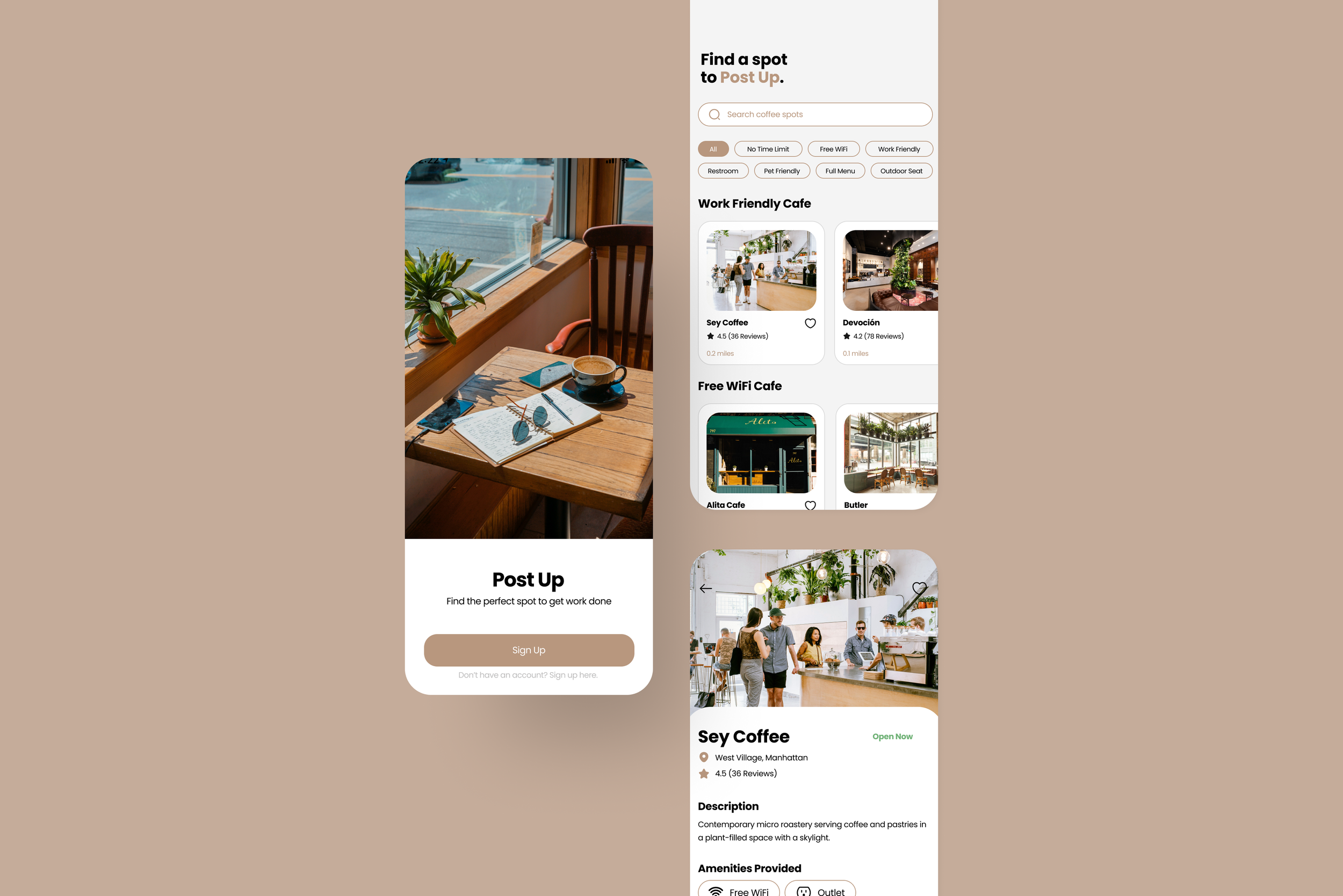
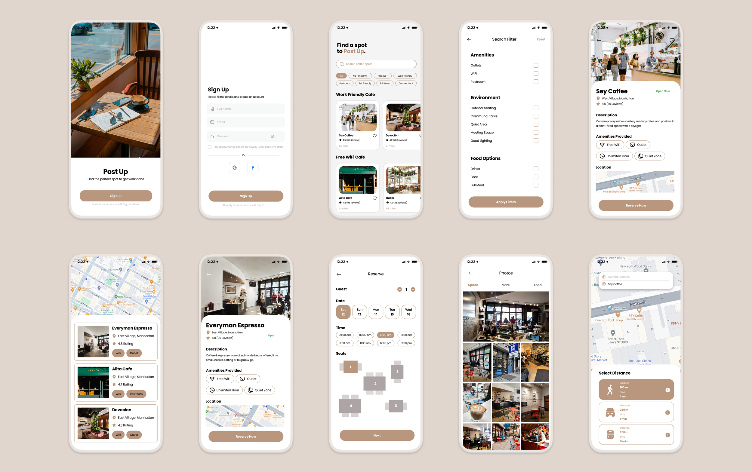
Launch the app → Apply filters → View options → Read reviews and view photos → Check current status → Reserve a table → Navigate to the location.
Sketch
Day 2
Lighting Demos
To gather inspiration and explore existing solutions, I researched how competitors have addressed similar challenges. I focused on Google and Yelp, two of the largest platforms people use when searching for a location, as they offer relevant insights into solving the problem of finding suitable workspaces.


By looking at these competitors, I was inspired by the features because it is something I would use too. But I also see a lot of places I would fix and things I would add to better enhance the user experience, such as adding more information related to working, or having the option to book a table right on the spot.
Crazy 8s
Before sketching my screens, I revisited the user experience map to ensure I included all the necessary steps for creating an optimal experience. This exercise allowed me to brainstorm and draw different variations of potential solutions. I focused primarily on the screen where users view locations and the provided amenities, as I felt this was the most critical part of the user journey.

3 Panel Board
I created a small 3-panel storyboard, selecting one critical screen from my Crazy 8s exercise and sketching out the screens that come before and after it. This helped me think through the user's next steps and visualize how the screens would function in a real-world context. It provided a clearer picture of the overall flow and interaction.
The critical screen I selected was the one displaying all the amenities users can choose from when selecting a place. Prior to this, users would be browsing various options. Once they apply their chosen filters, the following screen would provide detailed information about the selected location. This sequence ensures a smooth and logical flow for users as they search for the perfect spot.
Yelp
Yelp offers a similar experience to Google but organizes reviews into more specific categories, such as restaurants, movers, and plumbers. For cafe reviews, Yelp provides detailed information like:
Payment options
Accessibility
Amenities
Seating type

Google is the top search tool people rely on when looking for reviews and photos of a location. Some of its key features include:
Reviews
Photos
Popular times
Amenities
Atmosphere
Decide
Day 3
One the third day, I revisited the problem and to write down all the features I wanted to include in my sketches that will best solve the user’s pain points. I thought the most important aspect to focus on is when a user is looking at a location, they’re able to see the information that is related to what they’re looking for, such as the workspace environment or the work amenities that are provided at the place.


This 12-panel storyboard illustrates the user journey of searching for a coffee shop. It depicts key actions like browsing different options, applying filters, selecting a spot, reading reviews, and finally navigating to the chosen location. Each step is designed to streamline the process and enhance the user's experience of quickly finding a suitable workspace.
Prototype
Day 4
Based on the storyboard, I developed a prototype to visually represent the app’s flow. This prototype allowed me to test for usability issues and identify potential enhancements to improve the user experience.
Test
Day 5
I conducted five usability tests with remote workers who frequently work outside of their homes. Based on their feedback, I gained key insights that led to several design adjustments to better meet their needs and improve the overall user experience.
Homepage
One of the initial issues users pointed out was that the homepage seemed too simple and lacked features to help them narrow down options effectively. To address this, I added relevant filters and ensured that key information about each location was clearly visible at a glance.
Icons
Users appreciated the use of icons, especially when viewing the list of amenities, so I redesigned this feature to enhance clarity about what each location offers. Additionally, I added a map view at the bottom to help users easily locate the store.
Map View
Users encountered several issues with the map view screen. They wanted additional transportation options, such as by car or bus. They also noted that there wasn’t a “back” option if they weren’t ready to navigate immediately. I revised the screen to include various transportation options and allowed the users to start their journey whenever they choose.
Before


Before

After


Before
After
After
Reflection
Key Learnings
Participating in this five-day design sprint provided valuable insights into tackling critical business questions through design, prototyping, and user testing. Initially, I doubted the feasibility of completing the challenge within such a tight timeframe. However, the sprint taught me to concentrate on the most pressing questions and develop solutions efficiently. The time constraint pushed me to avoid getting bogged down in minor details and focus on delivering impactful results.
Challenges
One of the challenge I faced during the process was maintaining focus on the core problem without trying to address every issue simultaneously. Unlike my usual projects, where I often tackle multiple aspects, this sprint emphasized the importance of speed and efficiency. Additionally, the Crazy 8’s exercise, which was intended to be a quick brainstorming activity, proved more time-consuming than expected due to the need to generate eight different designs within a time limit. Despite these challenges, the sprint taught me valuable lessons about working quickly and concisely.
Let’s connect.
Have questions or want to collaborate? I'd love to hear from you!