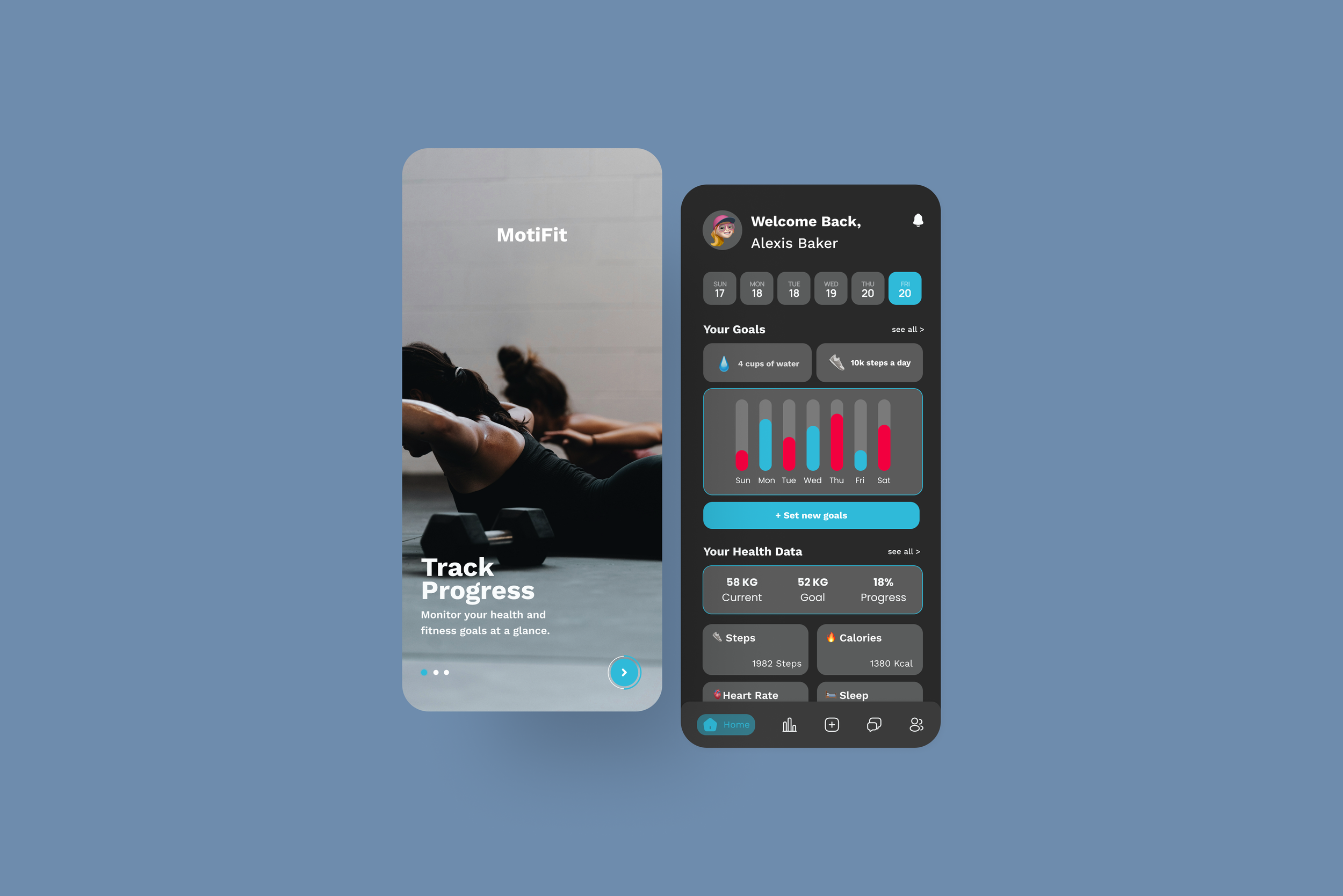
MotiFit
Mobile App
A fitness tracking app designed to boost engagement with personalized messaging, challenges, and community interaction.
Role: UI UX Designer
Duration: 6 weeks
Scope: UI/UX, Wireframing, Prototyping, User Testing
Industry: Fitness Industry
Problem:
The app faces a significant challenge with maintaining long-term user engagement. While initial interactions are strong, engagement typically drops after a few weeks, leading to a high rate of app deletions.
Solution:
Creating an integrated messaging feature that allows users to connect and communicate about their health and fitness goals and achievements.
The Design Process
Discovery → Define→ Design → Validate → Test
Discovery
Research | User Interview | Persona
Research
In the discovery phase, I focused on three key areas to gain insights into the industry and identify opportunities for enhancing user experience:
Motivations for Tracking Fitness and Health: Why users track their health and fitness to address their core needs.
Engaging Features: Identifying features that keeps users engaged with health and fitness apps.
Challenges in Engagement: Exploring the challenges users face in maintaining long-term engagement with fitness apps.
Additionally, I conducted a competitive analysis to identify industry standards and discover the strengths and weaknesses of similar products. By analyzing competitors, I hope to develop a more user-centric solution.
Affinity Map
To synthesize and visualize my research, I created an affinity map to organize my findings. This approach allowed me to categorize the data effectively, focusing on three key areas: app engagement strategies, competitive analysis, and the challenges users face with fitness apps.
Engaging Features
Many users are drawn to features like leaderboards and achievements. Incorporating elements such as challenges, rewards, and progress tracking taps into users' competitive instincts and sense of accomplishment, fostering consistent engagement with the app.
App Engagement Strategies
I explored various engagement strategies to understand how apps boost user interaction. Features like onboarding tutorials, reducing steps for account creation , and social features for interacting with friends were all elements I took into consideration when designing.
Gaps in Fitness Apps
In my research, I examined what other fitness apps are lacking to identify gaps and opportunities for improvement. I was able to pinpoint areas where user engagement drops off, where communication features are insufficient, and where the overall user experience could be enhanced.
User Personas
I developed two user personas to gain a deeper understanding of their goals, needs, and behaviors. This approach helped me design features and interfaces tailored to their specific challenges and requirements, ensuring the final design is both relevant and user-friendly.
The Fitness Enthusiast, Sara Mitchell
Age: 27, Occupation: Marketing Specialist, Location: New York City
About
Spends hours on phone everyday
Uses fitness apps daily when working out and owns a fitness tracking device
Works out five days a week
Participates in group fitness classes
Pain Points
Finds it hard at times to stay motivated
Struggles to find and stay consistent with the fitness app she uses
Wants to be able to share her progress with her friends and build connection with like-minded people
Personality
Goal oriented
Motivated
Sociable
Goals
Maintain and improve fitness level
Make connections with other fitness enthusiasts
The Conscious Tracker, Carter Hall
Age: 31, Occupation: Graphic Designer, Location: Austin
About
Prefers budget-friendly apps with no premium subscriptions
Uses Facebook and Messenger
Runs and bikes weekly to stay fit
Tracks nutrition values for meals
Pain Points
Limited by budget constraints when selecting fitness apps
Struggles with consistency in fitness routines
Needs an app that integrates health tracking with easy communication features
Personality
Disciplined
Minimal
Active
Goals
Maintain a healthy lifestyle
Achieve personal fitness milestones
Stay connected with friends and family for ongoing support and motivation
Define
HMW Statement
How might we integrate messaging features within the fitness tracking app to enhance user engagement and sustain interaction by allowing users to share health and fitness goals with their family and friends?
Design
User Flow | Low Fidelity
User Flow
In the design phase, my first step was to create a user flow, essential for mapping out the user's journey through the app. This process allowed me to visualize how users interact with various features and navigate the app, giving me a clearer understanding of the steps they take to achieve their fitness goals.
Red Route 1: Messaging
Navigate to 'Messaging' → View list of contacts/groups → Select contact/group → Send message → Recipient(s) receive and respond → Continue conversation → Receive notifications for new messages
Red Route 2: Setting Goals
Navigate to 'Goals' → Set a new goal → Track progress → Make progress → Send progress notification to group → Group receives notification → Group reacts with likes/comments → User receives feedback → User achieves goal → Send celebratory notification → Group congratulates user
Red Route 3: Creating Challenges & Inviting Friends
Navigate to 'Challenges' → Create a new challenge → Customize challenge → Set challenge duration/rules → Invite group members → Members accept invitation → Start challenge → Track progress → Create dedicated messaging thread → Share tips/progress/motivation → Send periodic updates/reminders → Challenge ends
These three main red routes were developed to maximize user engagement within the app. By outlining each step users need to take to achieve their goals, I was able to visualize the app’s layout and facilitate the creation of low-fidelity designs. This approach ensures that the design supports user interactions effectively and aligns with their engagement needs.
Low to High Fidelity Screens
Challenge Screen
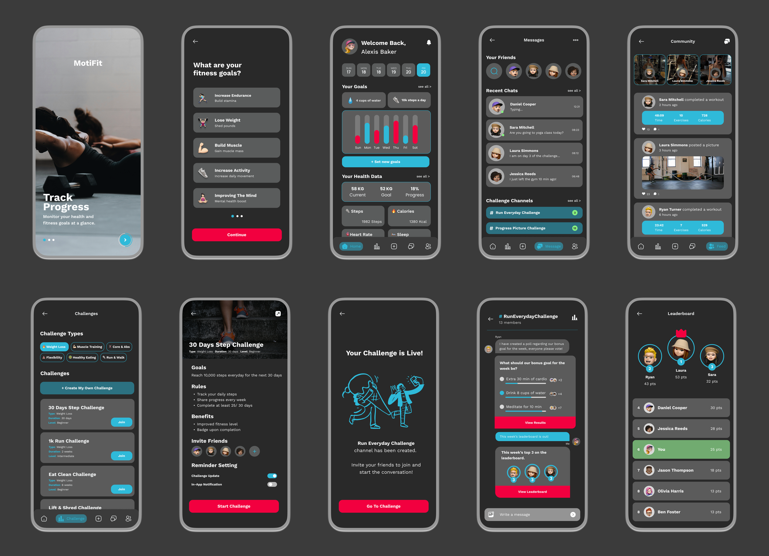
In the initial usability test, users mentioned it was hard setting up and finding a challenge. To fix this, I added filters that allow users to browse through various fitness categories and narrow down their options, making it easier to find relevant challenges.
Challenge Channel
This is one of the most important screens for driving engagement. Initially, users found it boring and similar to ordinary chat screens. To fix that, I incorporated gamification elements such as polls and leaderboards, which encourage interactive and competitive engagement among users.
Onboarding Screen
The onboarding screen is the first thing users see when they open the app, so I wanted to make it both engaging and straightforward.
Instead of a single screen with just the logo, I designed three separate screens that slide to showcase the app’s features, providing a dynamic introduction to what the app offers.
Test
Usability Test
After developing the high-fidelity screens, I conducted another round of usability testing where users interacted with the actual designed screens and explored the features. This round revealed several key usability issues, which provided valuable insights for further refinement.
1. Added “Copy Invite” in the Invite Friends Screen
In the second round of testing, users were unsure if the contacts shown were from their personal list or app users. I fixed this by adding a “Your Contacts” label with a short description and a “Copy Invite” link for easy sharing.
2. Navigation Bar
Initially, I did not have a navigation bar, but I found it crucial after observing users feeling lost when trying to return to previous screens. Adding this allows users to easily orient themselves and switch between screens seamlessly.
3. Reminder Setting
The original single toggle for reminders caused confusion. I improved this by adding three customizable notification types and including placeholder text to guide users in creating challenges.
4. Leaderboard
A key feature I wanted to include was a leaderboard, which users consistently brought up for motivation and engagement. Adding this feature not only keeps users motivated but also makes the channel chat more interactive and fun.

Reflection
Key Learnings
This project was different from any of my other works because it involved improving an existing app rather than creating a new one from scratch. I was tasked to enhance user engagement for the app by adding a messaging feature, which required me to stay focused and avoid spending time on other usability issues. This experience taught me the importance of prioritizing and addressing key issues effectively.
Next Steps
In future projects, I plan to focus on addressing the most important issues and tasks I’m specifically assigned, rather than trying to solve every problem. I’ve learned that while it's tempting to fix everything, it's more effective to concentrate on key problems to achieve better results.
Let’s connect.
Have questions or want to collaborate? I'd love to hear from you!


